


// Introduction
Starting from the Google Form questionnaire, we wanted to get some highlights regarding people’s online habits. The output is a data analysis and data visualization of the main questions and answers. The visualization got printed to show it to the client, but you can also find it online here.
// Process
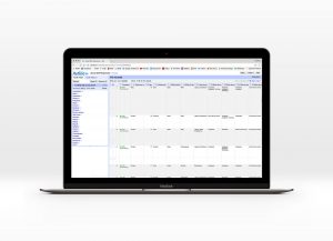 Data cleaning with Open Refine and Microsoft Excel

After selecting the most interesting answers from the dataset, we cleaned the dataset from duplicates or typos.
i.e. Milan, Milano, milan > Milan
Nee, no, Niet > No
With Microsoft Excel we could better cluster the data, especially with pivot tables, to have the final data ready for visualization softwares.
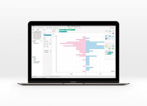 Graphs creation with Tableau

Using Tableau, a software for instant data analysis and data visualization, we could start getting some raw graphs and the first insights. Data need to be very clean and organized, otherwise the software is kind of complicated to use and understand.
When we are good with the results, we just export the PDF (File > Print > Save as PDF) to be able to modify it.
 Styling and layout with Adobe Illustrator
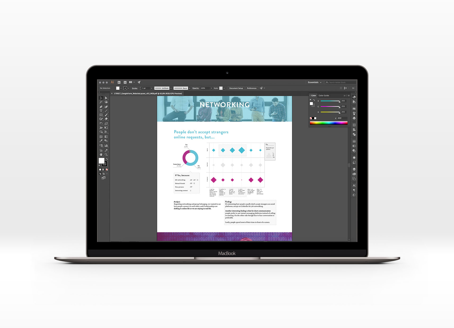
We first wanted to code a small and simple website, that’s why we chose a long scroll format. Using our brand colors (pinkDATASS and blueDATASS), we tried to visualize a story through our graphs. Thanks to these visualization, we could better show some of our findings.
// Findings
All the data visualizations can be read here. Below just the main findings.
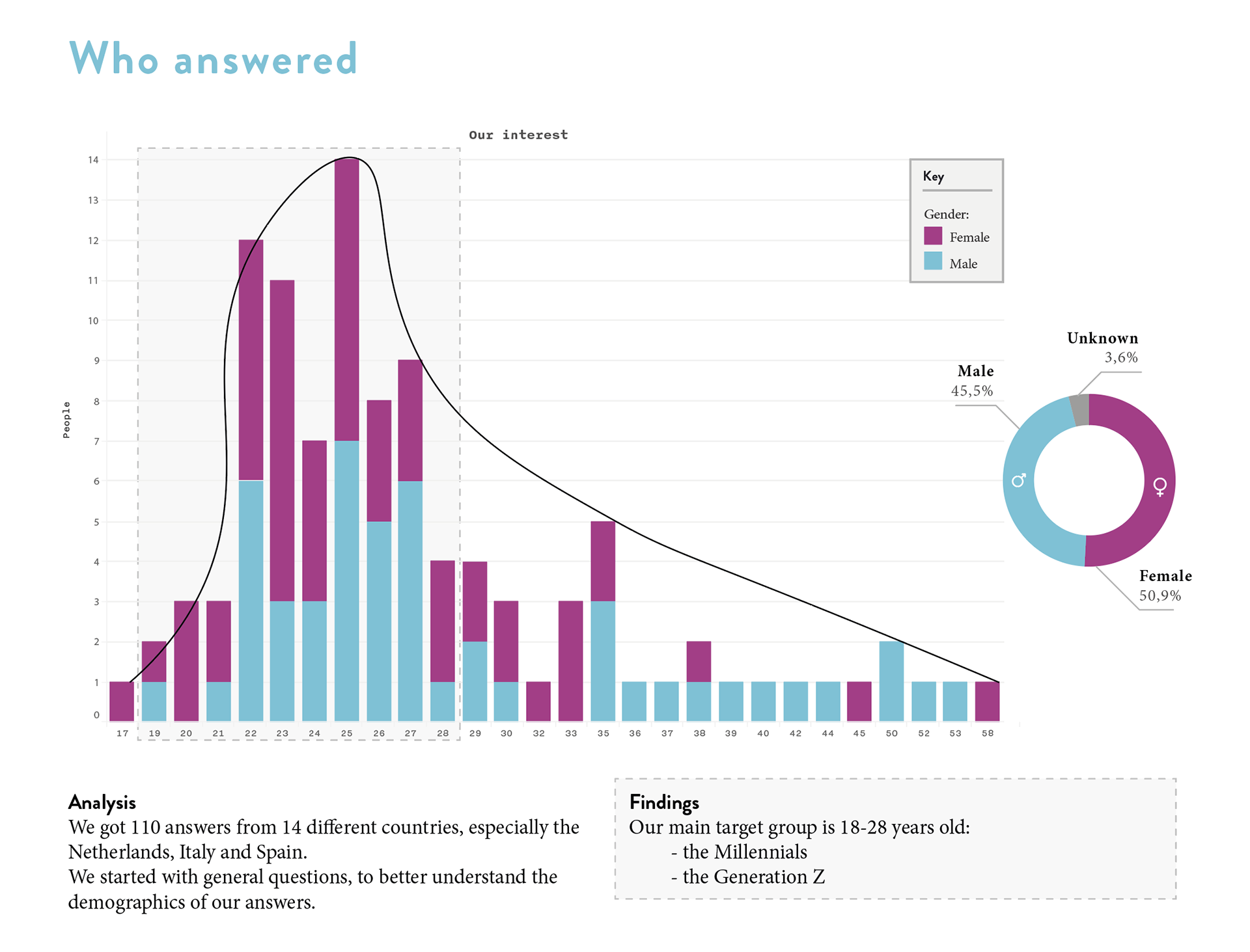
Our main target group is 18-28yo, equally distributed between males and females.
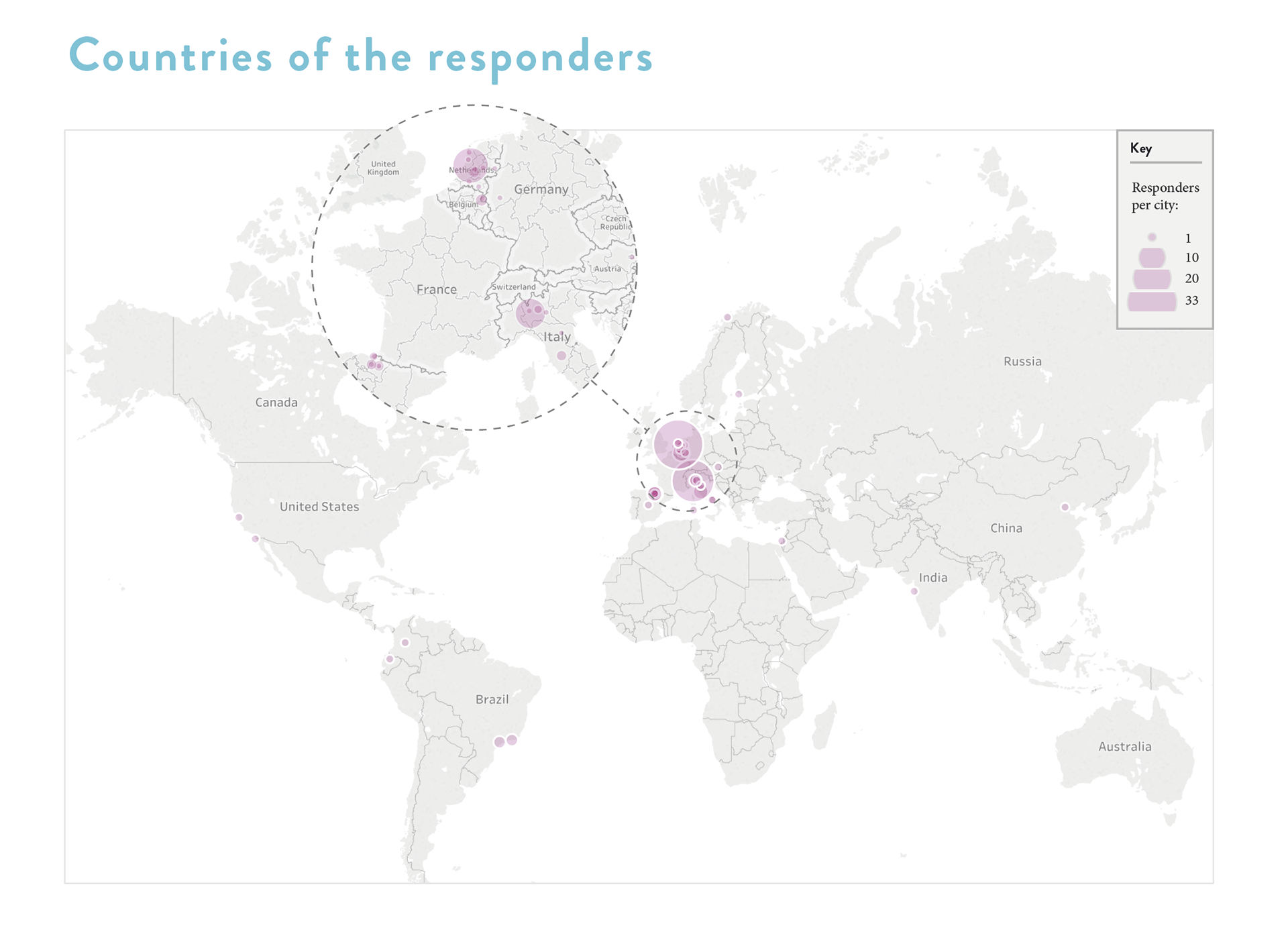
Most of the answers come from Milano (Italy) and Amsterdam (the Netherlands).

Most of the responders are into TV shows and technology. Some of them into games and sports.
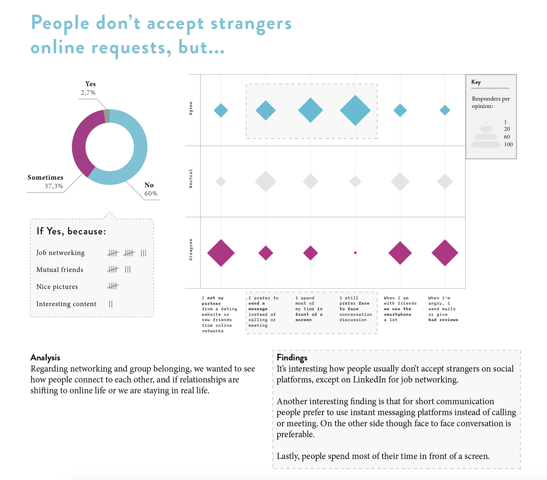
People don’t accept strangers online, except on LinkedIn for job networking. Instant messaging is preferred to face to face communication.
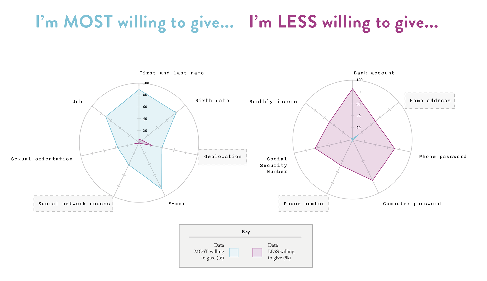
People are okay giving their geolocation (tag location), but they don’t like to share their home address. Moreover, many apps and services ask for the phone number, a personal data that people are less willing to give.
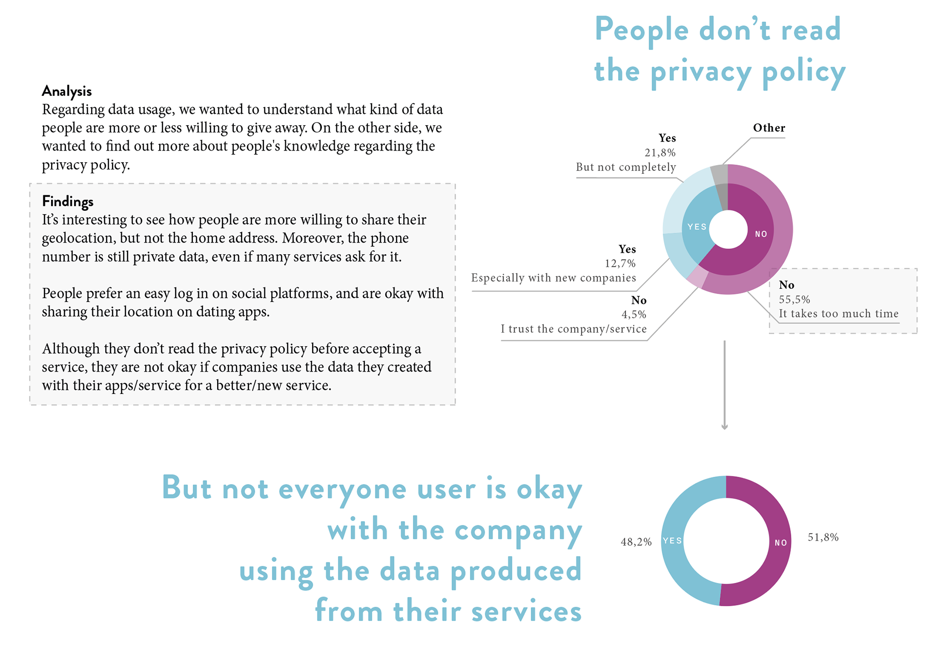
People don’t read the privacy policy because it’s too long. On the other hand, not everyone is okay with the company using the data produced from their services.
