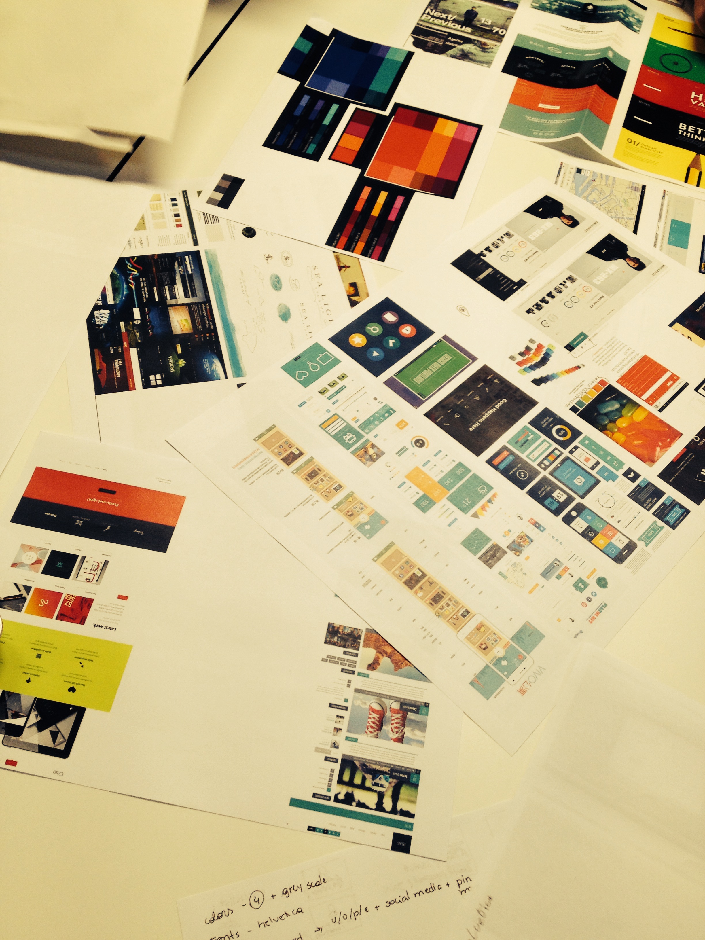
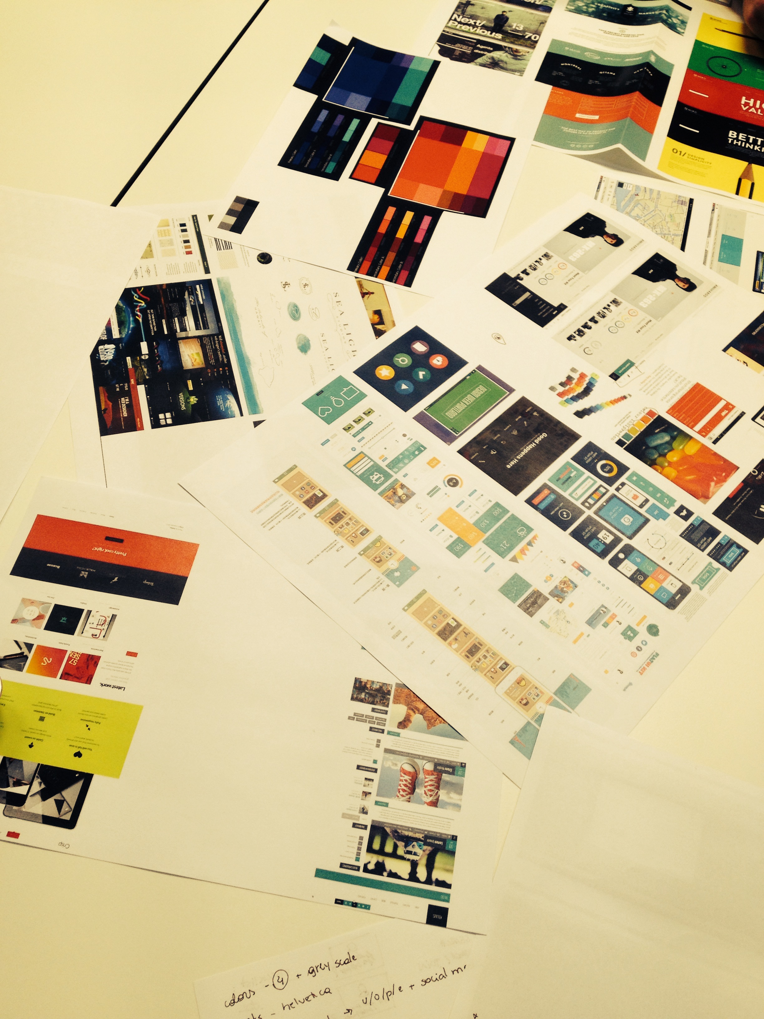
Building up from last week’s prototypes, this week we tried to zero in on colours, fonts, design icons and trying to come up with better, more defined outlines.
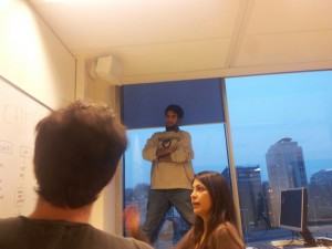
The Moodboards: A collection of colours, fonts, layouts and quirky design features was presented by all of us. We then discussed why we liked it or why it would be a problem.
All in all, we decided to revamp our logo, the colour palette and hence we will have a more consistent design from now on.
![]()

Our brain rocketing sessions: