So this week we were busy designing, testing, re-testing, re-re-testing and basically trying to make the web platform as intuitive as possible….. The coders couldn’t figure why every browser was such a pain in the A$#…. We couldn’t figure out why every tester was a potential threat to our ‘baby’…
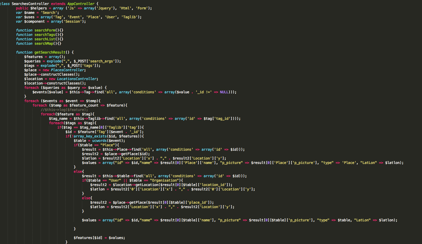
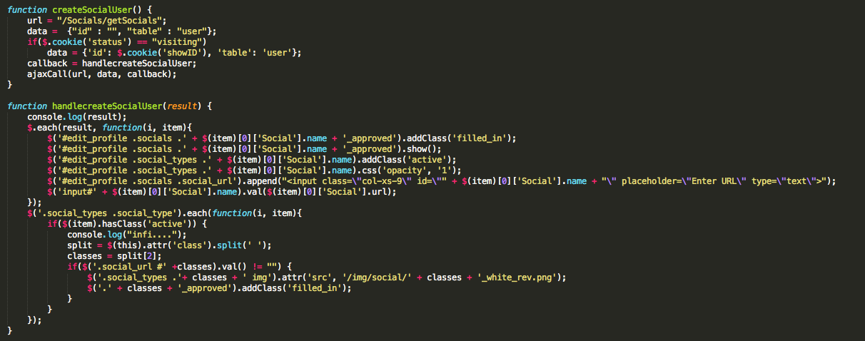
Here are some screen shots of the “coder’s dilemma”.

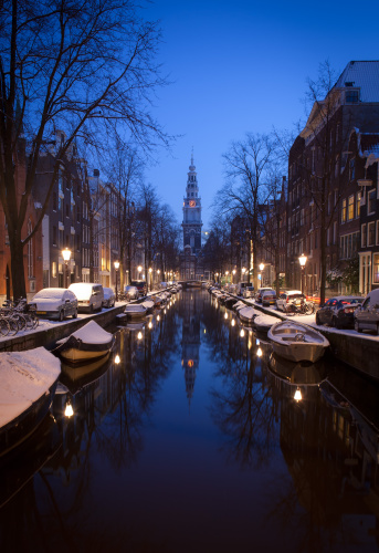
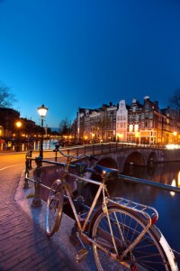
While a lot of things were still not working, we were quite surprised with the features which actually worked flawlessly. Take a look at our background images.

And after this week’s presentation, at the end of the day; what we can say with full conviction is :
At-least our presentation skills were Supercalifragilisticexpialidocious .
STAY CLAM &
ALLOW US TO CONQUER YOUR…. your….uhmmm.. errr… your phones ?? !!!
The Creative City team welcomes you back, and wishes you a Happy New year.
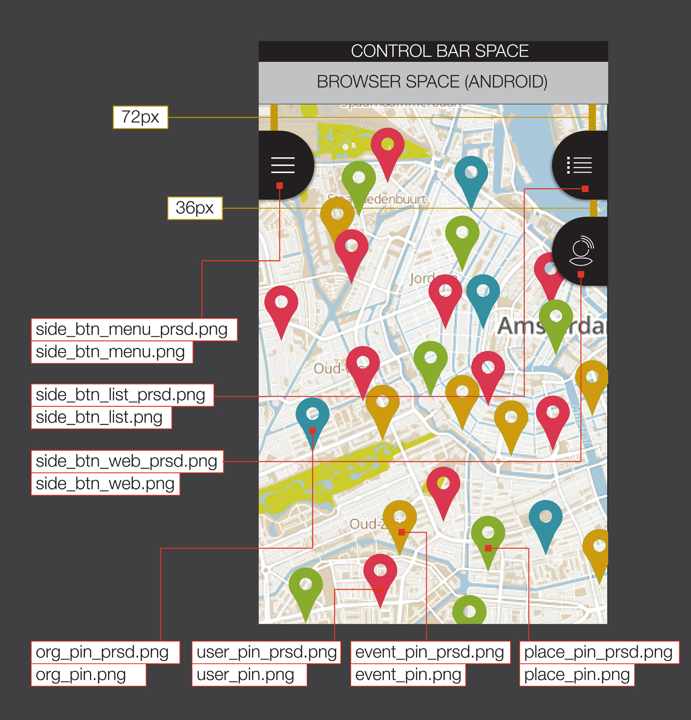
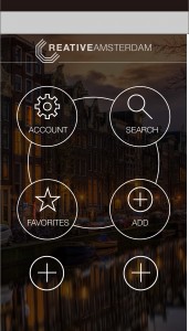
We have been working towards developing the platform and there’s some stark progress seen in terms of design and the website development. Within the next 3 days we should have the mobile version up and running, but in the meanwhile here’s a small pictorial trailer exclusively for you.
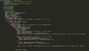
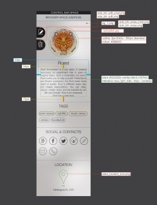
And this is how painful the whole process is. The designers have to specify each and every colour, font, shape, opacity and a million other details which makes a website appealing. ( F.Y.I: This is only one of the views).
So stay tuned for new updates and some kick-ass designs only for the people in Amsterdam!!
We have now made a more comprehensive overview of our web responsive platform. Check out the Creative City mockup video and let us know if your mind is not blown.
CC_Mockup_2
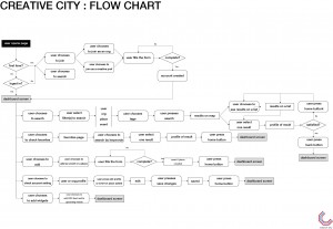
We also have a very detailed flowchart, which should give you a very clear idea about how the platform works and interacts with the server.
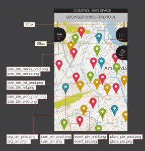
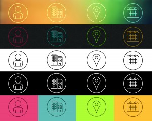
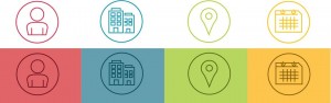
We also present to you, our icon palette which we derived from our mood boards.
So give it up for CJC Automatisering BV. Our programmers have decided to help us out with our out-of-the-world; Steve-jobs-coupled-with-jonathan-Ivy- web platform.
Ok, it’s not that bad. But, anyway, now that you’re updated, we can rest in peace.
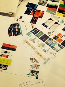
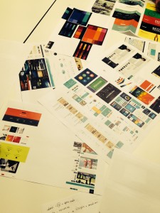
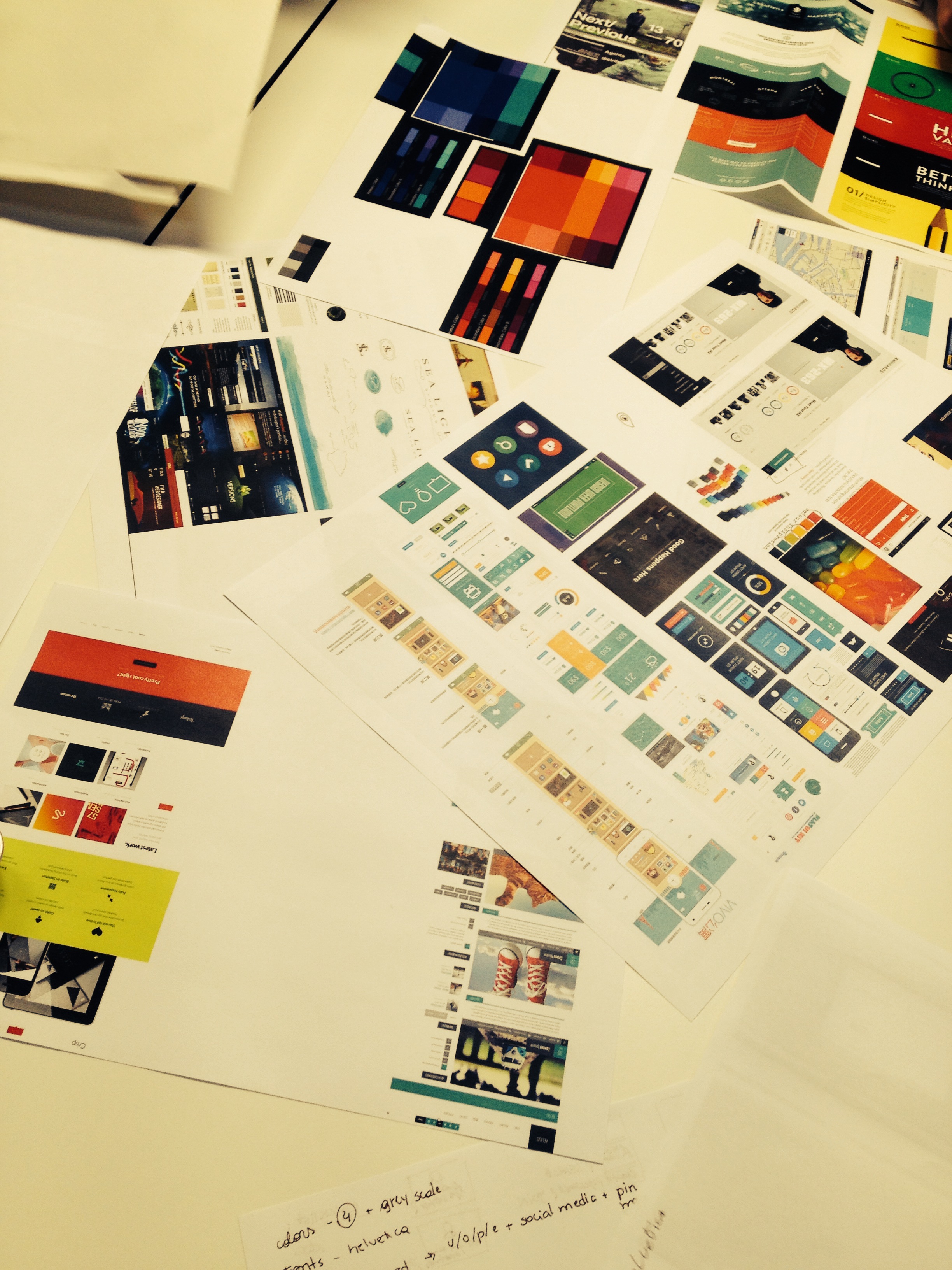
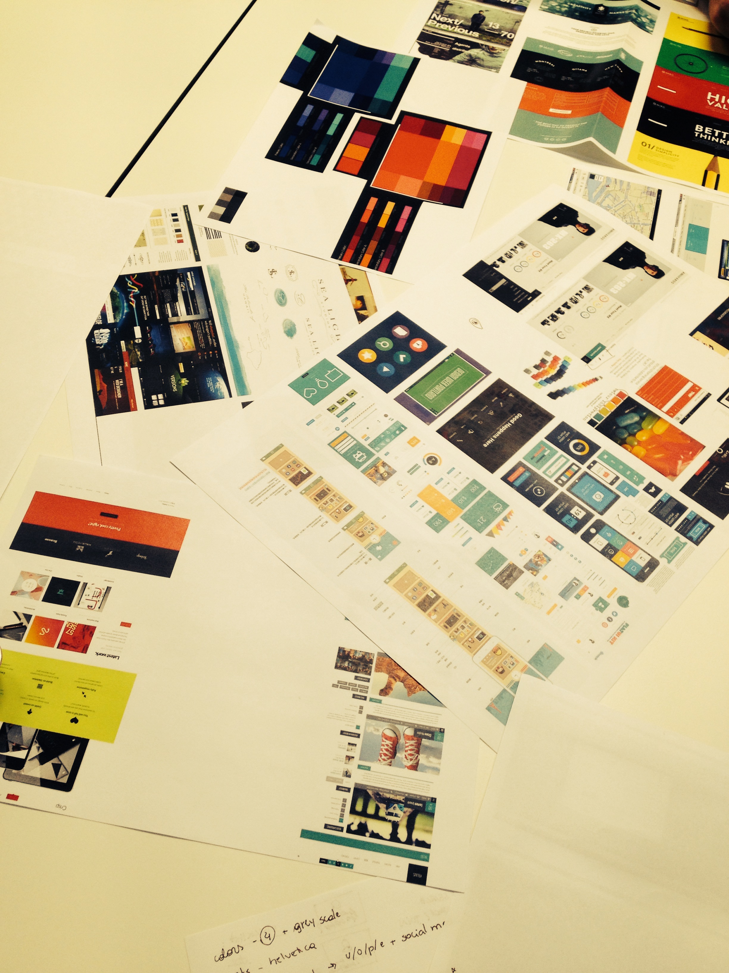
Building up from last week’s prototypes, this week we tried to zero in on colours, fonts, design icons and trying to come up with better, more defined outlines.
The Moodboards: A collection of colours, fonts, layouts and quirky design features was presented by all of us. We then discussed why we liked it or why it would be a problem.
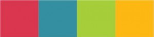
All in all, we decided to revamp our logo, the colour palette and hence we will have a more consistent design from now on.
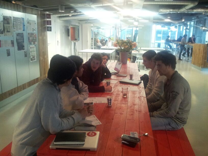
Our brain rocketing sessions:
Three weeks passed since our project started and we have finally designed our logo; Our identity !!
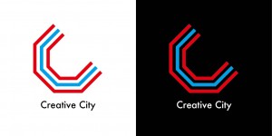
The inspiration behind this was three folds:
1. These lines means canal and streets. Both of them are symbolic scenery of Amsterdam.
2. The figure expresses “C”, the initials of our project name. And this “C” consists of connected lines. Connection for creative industries and creative professionals is a part of our goal.
3. Red stands for the color of Amsterdam and Blue means a canal.
Letters:
We used a font of “Futura medium”. Futura is a sans-self typeface designed in Bauhaus. Futura means future and looks like clean, standardized, stylish. We think it is appropriate for the creative city.