The app was too green and there was too little contrast, henece the style was adjusted to less transparency and more full colour. Further was the red colour for buttons and interactive fields interpreted as danger by the users we showed the app to, hence we chose another complementary colour to green which is a warm yellow.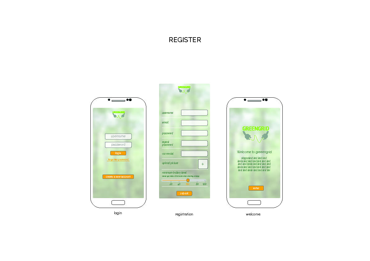
Amsterdam University of Applied Sciences
CREATING TOMORROW
Vehicle to Grid
Team
Anna Hornberger
annahornberger@gmx.de
Linda Zieverink
linda.zieverink@gmail.com
Paolo Di Labio
dilabiopaolo@gmail.com