


So, as you know meeting Submarine was an important turning point for our project. After letting it all come down, we kept up our courage; it was time to identify a new appropriate course of action. This time the starting point turned out to be concrete wishes from Submarine, in terms of what questions they want to answer by consulting the future data tool. Based on this we set categories – drop offs, sources, heat maps, demographics, Last Hijack – where we connected to tangible questions. For example, concentrating on drop off should not only answer that people drop of, but also the reason why people drop off. This question than can be approached from different sides. By thinking of what could be meaningful to know we dived the categories in sub questions and started to correlate data from the Google API in order to find ways to extricate answers. At first, by writing possible combinations down and afterwards testing it in Google’s Query Explorer. Which is an interactive tool to execute Core Reporting API queries, without actually coding it.
This tool lets you play with the Core Reporting API by building queries to get data from your Google Analytics. You can use these queries in any of the client libraries to build your own tools. By combining data we have tested if it was possible at all to get the data we would like to have. To give you an idea of how this works, a shortened explanation will follow. This is how the Query Explorer looks like:
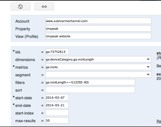 As you can see there are different parameters. The ‘dimensions’ parameter breaks down metrics by common criteria. You could consider this as the character for something you measure. You could for example insert ‘ga:browser’ or ‘ga:city’ in dimensions in order to break down for example page views of your site, which would be more interesting than just seeing the numbers. The ‘metrics’ parameter then can be defined as the aggregated statistics for user activity to your site, such as clicks or page views. If a query has no
 dimensions parameter, the returned metrics provide aggregate values for the requested date range, such as overall page views or total bounces. However, when dimensions are requested, values are segmented by dimension value. Any request must supply at least one metric (with a maximum of 10 metrics); a request cannot consist only of dimensions. The difficulty here is that a metric can be used in combination with other dimensions or metrics, but only where valid combinations apply for that metric. With the ‘segment’ parameter you can specify a subset of visits. The subset of visits matched happens before dimensions and metrics are calculated. With ‘filters’ you specify a subset of all data matched in analytics, for example ga:country==Canada. And last but not least is the ‘sort’ parameter, that stands for the order and direction in which you want to retrieve the results, based on multiple dimensions and metrics.
A specific need for Submarine is to focus specifically on the first 30 seconds of the interaction with the documentary. The would like to know what is exactly happening within specific timeframe. We tried to do this by combining different data and filters, but the Query explorer gave us a hard time doing this. We tried to filter as ‘timeOnPage <=30’, as well into ‘segments’, while constantly recombining different dimensions and metrics. Luckily we met Emile on Friday. He is the programmer who implements the codes in order to distillate the data out of Google Analytics API. We discussed the difficulties we faced and tried to solve this together. It turned out that the ‘timeOnPage’ wasn’t the right metrics to use. Instead we should use the ‘visitLenght’ with a quit specific filter we didn’t know of. To give you and idea: one of our sub question was ‘how many visits come from a certain device and how many drops-off are there in the first 30 sec.? The right query looks as the following:
 So, we spend quite a lot of time playing and testing with the Query Explorer. We discovered more or less what is possible and what not, so it was time to bring all this together with the correlations made by Stefania and deciding what questions and correlations are going to be priority.
After the meeting with Emile, we all sat together and agreed that it was time for a new plan. Last Hijack will be released somewhere around the first week of April and this will provide us the opportunity to analyze the data that Last Hijack produces. This means that it now is important to decide what data we actually want to capture and analyze for Unspeak, but note that these correlations are generally applicable for interactive documentaries (and therefore, also Last Hijack). Since Las Hijack will be released somewhere around the first week of April, this only gives us approximately 3 weeks to finish the correlations for Unspeak and that is why we decided to focus on six custom reports which we will translate into visualizations. Below you can find short overview of the correlations that will be made and the questions we will attempt to answer on basis of the correlation.
1A. In which countries are people having the most technical problems with watching the documentary?
Country / Visits / BounceRate / PageViewsPerVisit / AvgTimeOnSite
The accompanying visualization for this correlation should contain the option of zooming in on a country that, for instance, has a high bounce rate. In order for the viewer to see if this I maybe caused by a certain provider, the viewer can select any country and see which providers are causing problems. The appropriate question and accompanying correlation for this is:
1B. Are internet providers in a certain country causing problems?
Country / NetworkLocation /VisitBounceRate / AvgTimeOnSite / AvgPagePerVisit / Visits
2. Is there a problem with mobile browser, screenresolution or the loadingtime?
MobileDeviceInfo / Browser / ScreenResolution / Visits / VisitBounceRate / AvgTimeOnSite / PageViewsPerVisits
3. Is there a problem with a certain operating system, screen resolution or browser?
OperatingSystem / Browser / ScreenResolution / Visits / BounceRate / AvgTimeOnSite
4. What source(s) give us the most/least engaged* users (* in terms of page views and time spend)
FullReferrer / Visits / PercentNewVisits / VisitBounceRate / PageViewsPerVisit / AvgTimeOnSite
5. How well are spate pages doing?
- How many people leave from a particular page?
- How much time fo people spend on the page?
- What’s the chance that they enter on a particular page
PageTitle / Entrancerate / ExitRate / PageViewsPerVisit / AvgTimeOnPage
6. Segmenting age groups according to age brackets:
- Where do visitors come from (what’s their referralpath?)
- What are their interests?
- How much time do they spend on the website (per gender)
- What are the best references for certain age groups with certain interests?
VisitorAgeBracket / Gender / Interests / RefPath / BounceRate / PageViewsPerVisit / AvgTimeOnSite
Unfortunately this last custom report is not possible yet since we don’t have demographic data from Google Analytics due to a certain threshold for a certain amount of users (and we do not know what this threshold is).
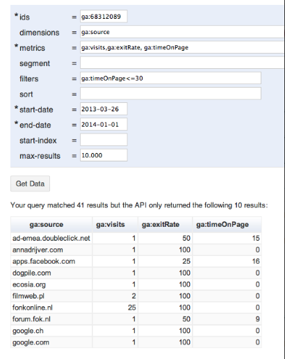
The rest of the custom reports have been tested in the Google Query Explorer and the data these tests produced have been exported into excel files. Although we are still busy with figuring out what these custom reports exactly tell us, the next step will be trying to visualize this data into simple visualizations.