


Hello world! Its been a long time. Definitely about time for an update, because we have not been sitting on our hands.
In our last meeting with Submarine it became clear to us that we should not focus on giving an overview of all available user data, but that we should focus on detecting potential problems. Instead of redesigning the Google Analytics visitors flow, we have now shifted our focus on concrete questions the visualisations should answer. Therefore we decided on 3 categories and linked these to three main questions.
The main question that goes with the BEHAVIOR category is how are users exploring the content and what are the top pages for driving or stopping exploration of the content? This category is all about page performance. You should think of the entrances and exits per page pageviews, the average time that is spend on a page and the number of pageviews per visit.
Within ACQUISITION the focus lies on the question what the process of user acquisition is and from which referral sources the most/least users come from. Information about referral performance is central here. In other words here we look to the influence that certain referral sources have on the way people engage with the website.
The main question within TECHNICAL is if we can identify technical problems with watching the documentary? The focus here lies on people that drop off and detecting the causes of this. For example by looking if high numbers of people that leave are linked to certain browsers and screen resolutions that could indicate that there are technical problems that cause drop offs.
By defining sub questions within every category we started correlating available data in order to extract answers. When we had found meaningful queries, next step was visualising it in a readable manner. We realised that one of the big problems with Google Analytics is that you need to spend a lot of time with it to understand what you need to look for. To save you time and work our main demand is highlighting relevant information and making the biggest problems stand out. Therefore we defined problem indicators and best-case scenarios for each visualisation, which we will elaborate later in more detail. For now we will discuss 3 visualisations.
VISUALISATION 1 [BEHAVIOR]: Page performance: pageviews and average time on page
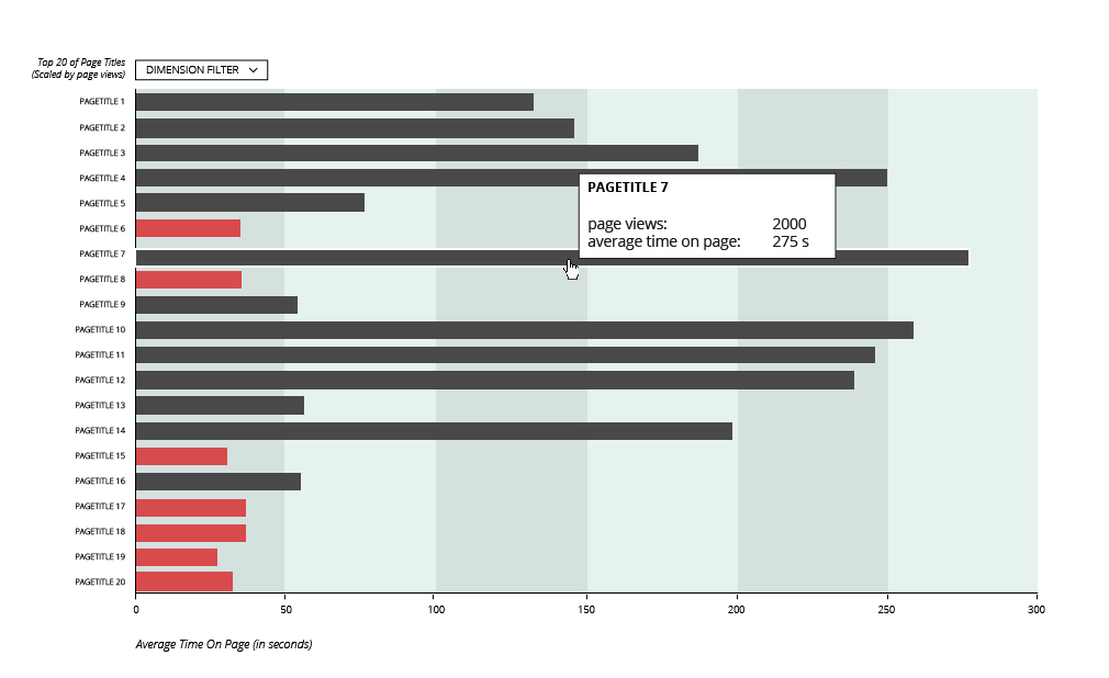
Explanatory note
This graph shows how much time users spend on a page (on average) OR by using the toggle, how often this page has been viewed. Pages that are highlighted with red indicate “under engaged” content and might be worth looking at.
*Note
The sources listed on top is source generating highest number of visits, list is descending.
Problem indicators
– Low average time on page
– Low number of pageviews
Extra strong indicator: the pages that are both listed in the top and highlighted in red (since the pages are sorted on visits and pages with most visits are therefore listed on top).
VISUALISATION 2 [ACQUISITION]: Referral performance: Volume & Bouncerates
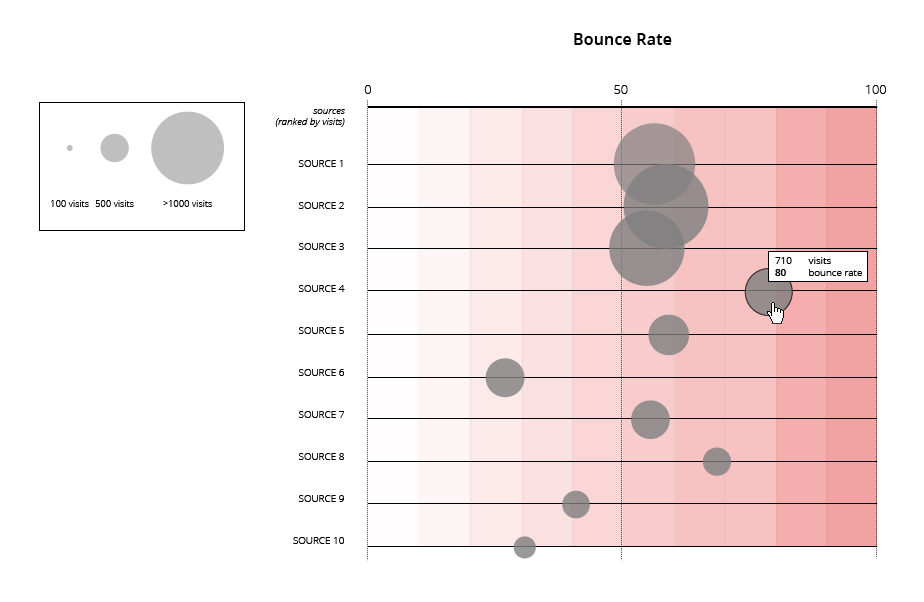
Explanatory note
Per referral source: how many visitors leave the website without any interaction (bouncerate). This helps extract which sources drive traffic to your website and also how many of the visitors leave without interacting with the content at all.
Problem indicators
– high number of visits and high bouncerate (visitors that leave the website without any interaction)
– low number of visits and high bouncerate (visitors that leave the website without any interaction)
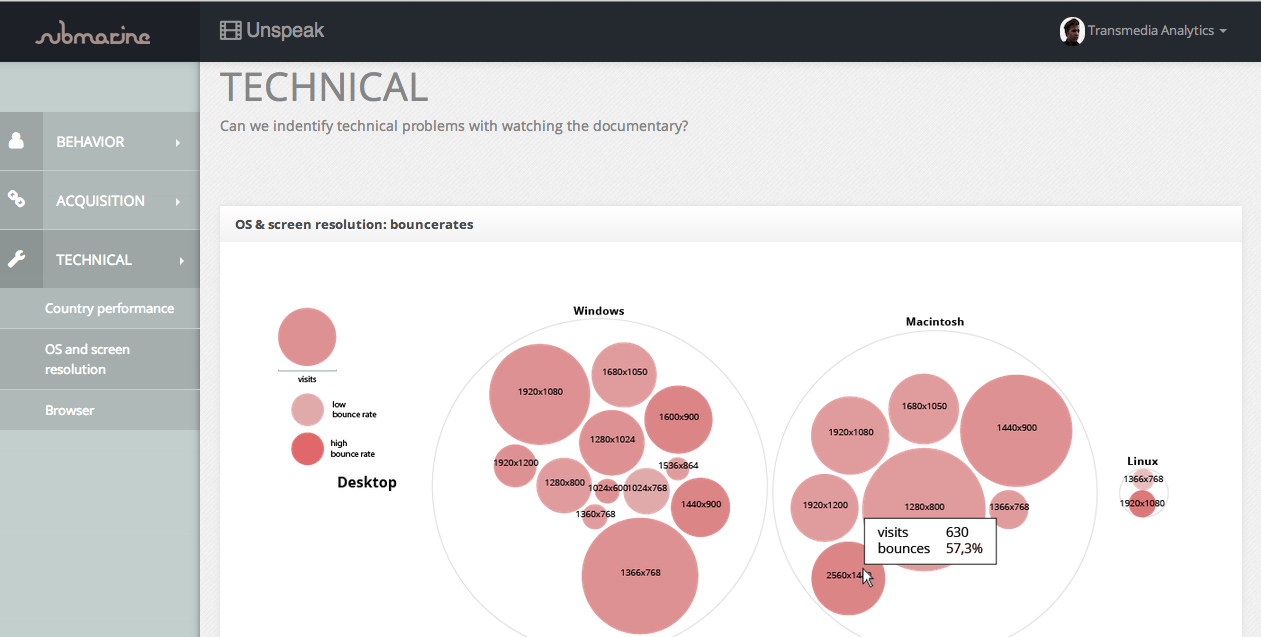
VISUALISATION 3 [TECHNICAL]: Country performance: volume & bouncerate

Explanatory note
This graph shows which countries are driving the most traffic, and how much of that traffic bounces without interaction with the site. If problem indicators show an issue, you can select a country and see list of providers in that country to extract whether the problem is with one specific provider.
*Note
high bouncerates might indicate language barrier.
Problem indicators
– Countries with high number of visits and high bouncerates (visitors that leave the website without any interaction)
– Extremely high bouncerates (visitors that leave the website without any interaction)
But there is more. We also started thinking about how the tool should look itself. In the sense of a dashboard. Big big thanks to Tamara (one of the programmers at the MediaLAB) for her endless patience in teaching us programming basics. We proudly present you the result:
Note that this a screenshot; its interactive for real!
We have all presented this to Submarine due the 17th of April, which turned out very well. They liked what they saw; we are definitely in the right direction. Talk to you soon about what’s next ….