Homo Infographicus
Tracking your own life, personal data nightmares, improving lives with data and even duck face wars in ‘selfiecity’; all subjects that came across during the seventh edition of the Infographic Congress, held on14 March 2014 at Zeist. A day that was al about using big data in multiple ways, for different purposes and accordingly visualized in manifold forms. Guided by Petra Grijzen, a fully loaded Figi Theather was ready to get inspired.
The day started with a great kick off by Nicholas Felton aka ‘Mister registering it all’. He showed that not only big companies are in charge of your data but that you can also gather it yourself and doing pretty cool stuff with it. By gathering data that he produces in daily routines, he designed his now-famous ‘Feltron Reports’; a translation of numerous measurements specific to his own life, into a wide variety of graphs, maps and statistics that reflect his year’s activities. This is what he calls ‘personal annual reporting’, the distillation of data out of your own life. He discussed different approaches of doing this. One of them is the archeological approach, or in other words using sources of data after an activity, which formed the fundament for his first personal report. Books he read, restaurant he has been, trips he made, music he listened to, the amount of coffee he drank, the photo’s he took (1% were of is cat), he all summarized and visualized it. The second way of gathering information about your life, he called ‘hoarding’: documenting as much information as possible. This turned out to be a lot of work to do manually, so he developed an app that would help him with documenting his life, called; the Reporter App, with which you report activities only on certain times. While assuming that (maybe) his friends and family would be interested in this, it gained much more attention than he thought; it went viral.
In contrast to Felton’s argument Jack Medway (a.k.a. John Grimwade) talked about ‘The personal data nightmare’. He argued that it simply useless to document everything in your life, or in his words: “just because you can does not mean that there is any meaning in doing this”. Medway simply does not care about this overload of meaningless data and suggests that in this information age you should only use simple and useful visualizations. Medway underpins his argument with two different chapters of visualizations: ‘No thanks’, and ‘Yes, please’. Within the ‘No, thanks’ chapter he argues that although visualizations can look very pretty, there are way too much infographic designers that only focus on the esthetic parts of ‘dataviz’ rather then actually represent data in a meaningful way. In the ‘ Yes, please’ chapter Medway argues that in order for information to be meaningful and readable it should be presented in clear and simplistic way and easy to read visualizations.
Yael de Haan focussed in her presentation ‘Every picture tells a story’ on the process of making infographic it self. During her research she identified different sorts of collaborations between infographic designers and their clients. De Haan identified four collaborations, which all focus around one central problem: ‘Which story do I want to narrate to the viewer’. Every collaboration between designer and client works in the same order, namely: identification, coordination and reflection. De Haan argues that within every visualization project the designer and the client should always asked themselves ‘what does image actually add to the text’.
 A whole other way of looking at data was provided by Stefanie Posavec. Posavec is into data illustration; using data as inspiration for art. She summarizes her conception of data illustration as ‘Communicating a message that goes beyond the message found within this data’. One example of her work is the so called ‘Facebook dance’, which is based upon love relation between couples on Facebook. She attempted to translate a ‘virtual dance’ existing of shared posts, likes and comments, to an physical dance between the lovers.
While the morning was considered as the more theoretical part, after lunch (with a great lunch, including sausage rolls!) a few specific cases were shared with us. First Thijs Niks, told us all about moving ‘from paper to pixels’, where the current trend from traditional newspapers that are offering a digital version was the central theme. Based on his experience in a project he did for NRC, he emphasized the importance of a good interaction design when translating concepts into it’s digital version, rather then just copying content to a online environment. Since you are not only competing with other newspapers, but also with not perse news related platforms like social media. You should consider its goal, divide your attention, break through the conventional reading methods and realize that digital environments have different rules.
Renato Valdes was presenting his ‘Daily 30 seconds’, that arose from the idea of ‘making moving more fun’. The fast-growing startup’s mission is to make people using technology healthier and happier, by giving them advise based on the data they produce. Their shared passion for health comes from two completely different backgrounds, but has been the driving force to establish the company. Renato once weighed 145 kg, but is so fallen that he weighs only 80 kg. (YOU GO RENATO!). Using passive tracking, the app calculates the average number of minutes the user moves a day and motivates him or her to the Daily 30 to do the minimum number of active minutes per day that a person needs to stay healthy.
In the third case the ‘LocalFocus’ was discussed; a service for local journalists that focusses on making big datasets accessible and understandable for local journalist so it can be used as source for reporting. Founder Jell Kamsma explained how national datasets are getting disaggregated in local ones that not only provides numbers but also a broader context. Via a intuitive, drag and drop interface its main goal is making data journalism and its new possibilities approachable for local journalists.
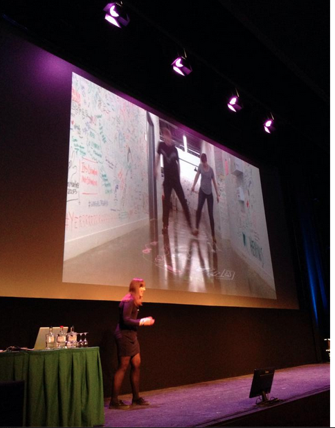
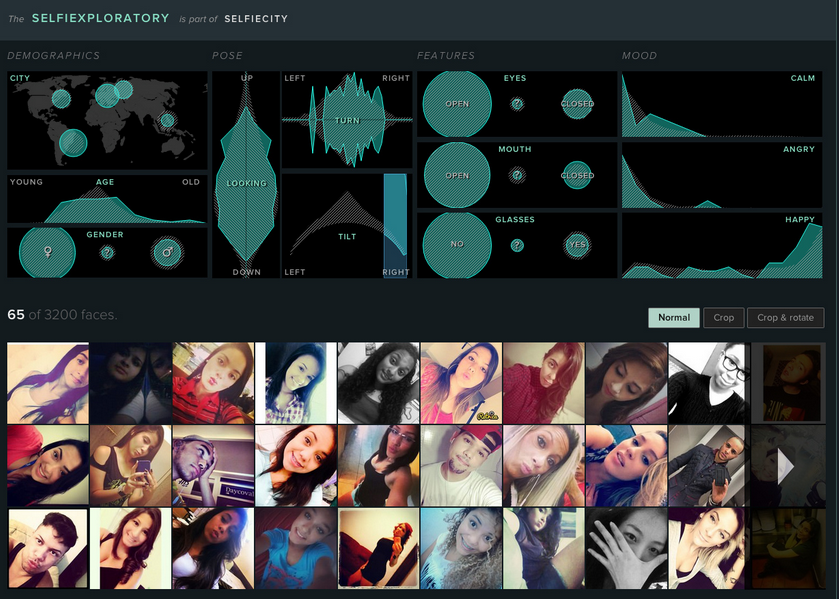
In the last part of the Conference Moritz Stefaner presented his work; ‘Selfiecity’. Stefaner focusses in this project not on the dataset that is given but rather uses visual content as data. For this project he gathered a lot of public selfies found on the internet and divided these into five different cities. He then tried to link these selfies to each other to try and find similarities between them, using them as a sociological research tool to identify changes in cultural values. A very interesting ‘digital humanities’ approach, you should really take a look: http://selfiecity.net/
All there is left to say, is that we got very inspired by all these great presentations and now know a little bit more about what is going on in the world of Infographics. Special thanks to Frederik Ruys, for inviting us to this great Conference!
Talk to you soon…