


So, some serious work has been done this week! Time to tell you all about it.
While in the previous weeks discovering the broader context of the project was particularly high on the agenda, this week somewhat actual designing is in progress. The focus here is re-visualizing Google Analytics’s ‘visitor flow’. This includes a lot of different features, so we decided to concentrate on specific functions within this flow. Namely the visualization of user paths per segment and visualizing number of visits. While our superfine researchers dived into literature in order to find solutions for the first problems we have identified, our top notch designers started of with a lot of experimenting with different forms.
While talking about visualizing numbers of visits in its most effective way, think of deciding how to display numbers in a meaningful way. For example using ratios, percentages, or averages instead of raw counts. Loose numbers tell you the amount of visits, but for example correlating them to a certain average this numbers are of greater significance; you can also see if they are above or below the average. When giving this numbers a proper shape, by visually encoding them, the graphic saves you time and energy by summarizing the meaning of a certain number.
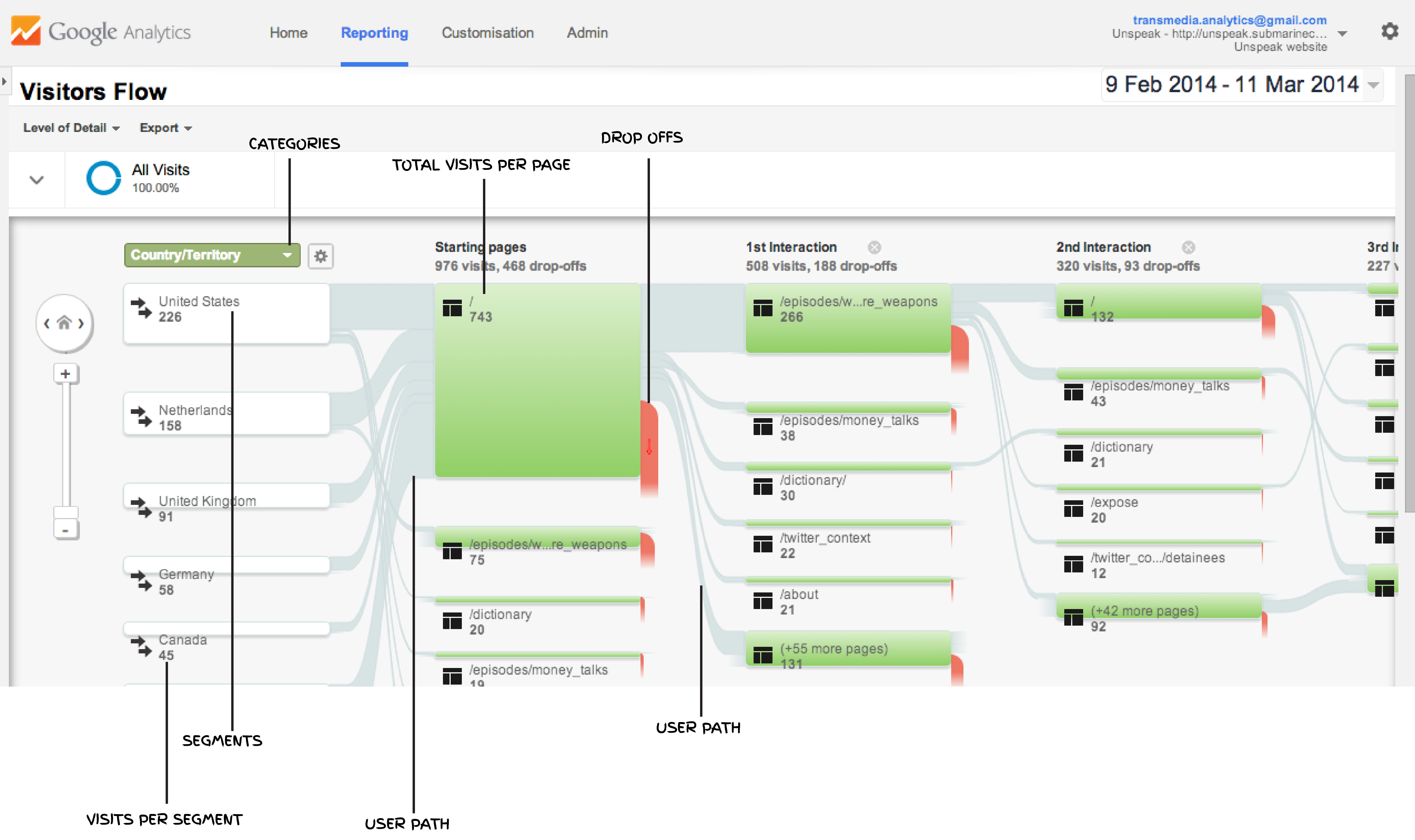
The visitor flow is based on a number of properties that also should be included in its redesign. First it’s divided into ‘interactions’, in other words into concrete actions which accordantly lead that the visitor to a certain part of the site. In this is for example specified as a certain episode or interactive element. As you can see in the above image on the left, this data can be displaced according certain categories. For example country, city, browser, city, language etc.to segments; in this case into ‘United States’, ‘Netherlands’, ‘United Kingdom’, ‘Germany’ and ‘Canada’.
Or for example displaying data specified on ‘browser’, this segments would be ‘Chrome’, ‘Safari’ etc. Though its clear in the ‘startpage’ column what the amount of visits from a certain country is, all countries are mixed up as a total in the ‘first interaction’. After the first interaction it doesn’t become clear anymore what amount of visitors come from which country (segment). In our opinion, when selecting a segment it should be possible to track this segment throughout the whole visitor flow. Also, the visualization should provide the opportunity for the viewer to have an overview of the visitor flow as a whole. Yet, it is not possible to view the paths per segment individually within the general overview of the visitor flow. This is a important aim for the redesign, but turned out to be very complicated. Things we kept in mind while designing (based on research) were things as ‘visual hierarchy’, because to many lines obscure the message. ’In information graphics, what you can show is as important as what you hide” (Cairo, n. pag.). Therefore it could be useful to integrate the possibility of highlighting certain segments, keeping the secondary in the background.
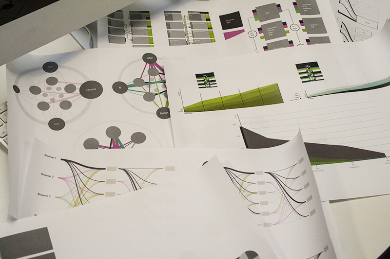
But we are getting there and came up with a few potential solutions, as you can see in the right image above. Next step is testing them. Unfortunately, we still don’t have the actual dataset. Because this will take some time, we have created a ‘fake’ dataset for testing.
We will keep you posted!