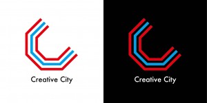
Three weeks passed since our project started and we have finally designed our logo; Our identity !!
The inspiration behind this was three folds:
1. These lines means canal and streets. Both of them are symbolic scenery of Amsterdam.
2. The figure expresses “C”, the initials of our project name. And this “C” consists of connected lines. Connection for creative industries and creative professionals is a part of our goal.
3. Red stands for the color of Amsterdam and Blue means a canal.
Letters:
We used a font of “Futura medium”. Futura is a sans-self typeface designed in Bauhaus. Futura means future and looks like clean, standardized, stylish. We think it is appropriate for the creative city.


